- Project team
- Product Design Engineer
- Year
- 2026

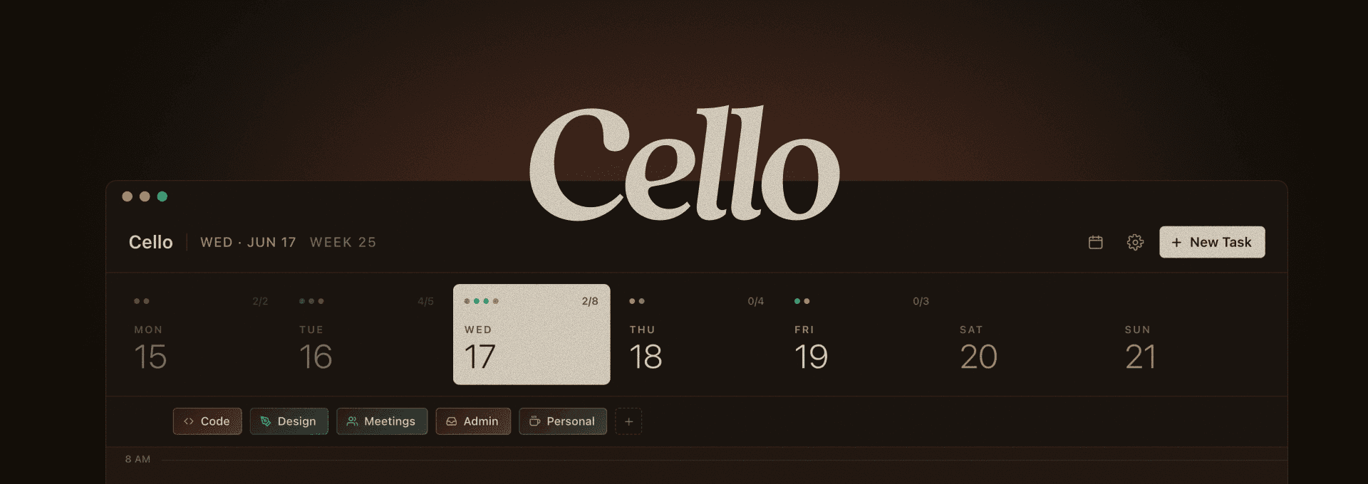
Planning one realistic day at a time
A little Mac app I built to lay my day out on a timeline, and finally see where my time actually goes.
Stack










Cello is a little Mac app that lives in the menu bar and helps me plan one day at a time. I made it because I kept running into the same problem: to-do apps are great at piling up tasks and useless at telling you whether they actually fit into a real day. I designed and built the whole thing myself, its identity and look and feel as much as the way it works, and it runs entirely on my own machine. No account, no cloud, nothing to sign into.
The endless to-do list problem.
A list doesn't know what time is. It'll happily hold thirty things for a day that has room for six, and then you spend the day feeling behind for no real reason. The thing I kept coming back to: planning isn't about writing down more, it's about being honest about what actually fits.
Plan the week, live the day.
On purpose, Cello only lets me plan the current week. There's no endless future to keep shoving things into, and that one limit does a lot. It keeps me honest and keeps my attention on the day right in front of me, one day and one week at a time.
A timeline you can just grab.
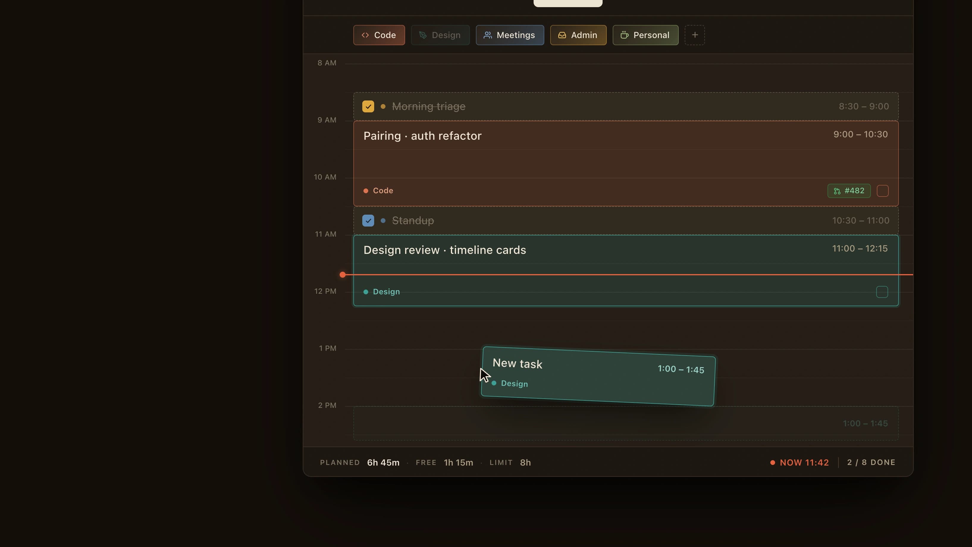
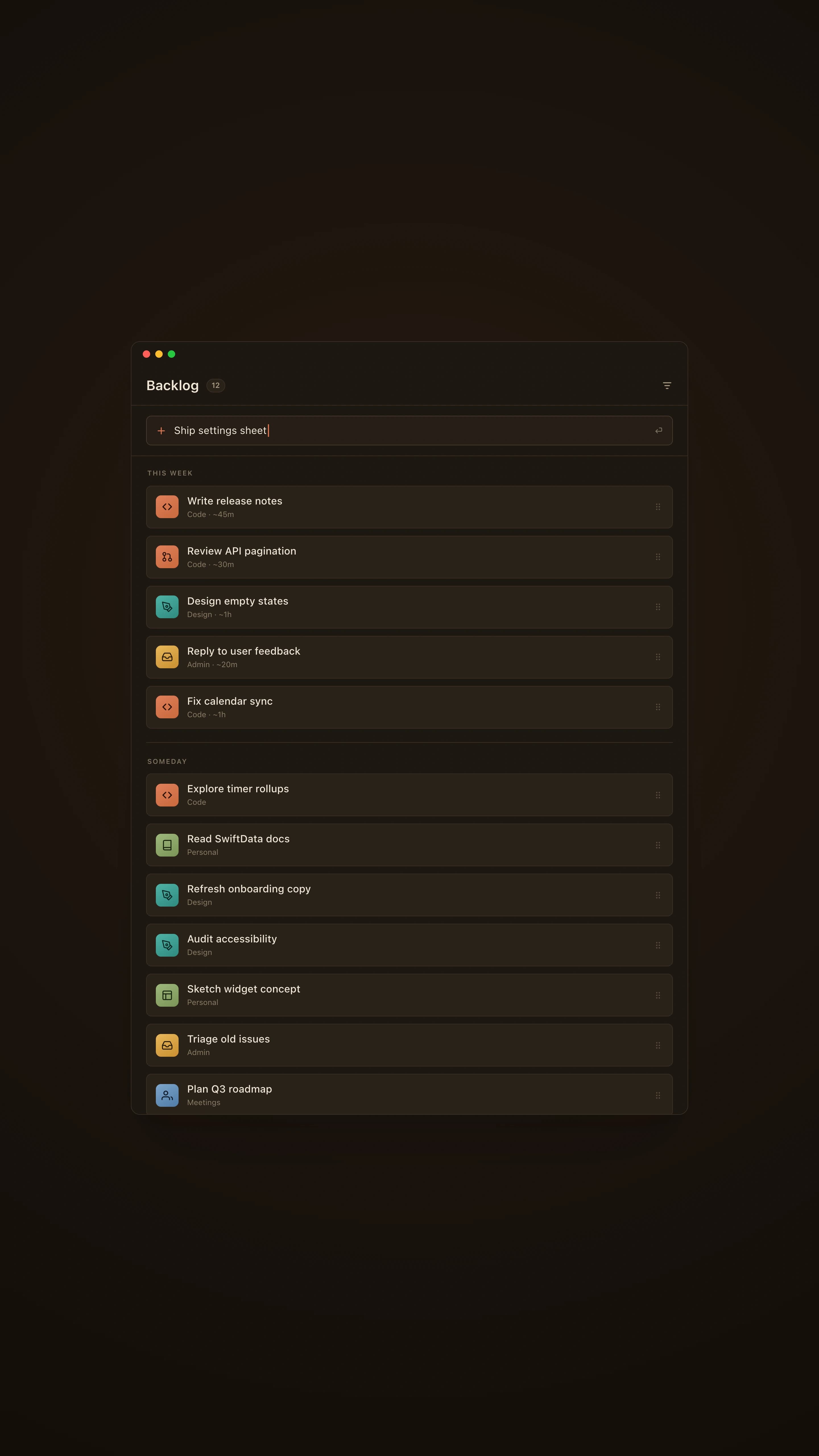
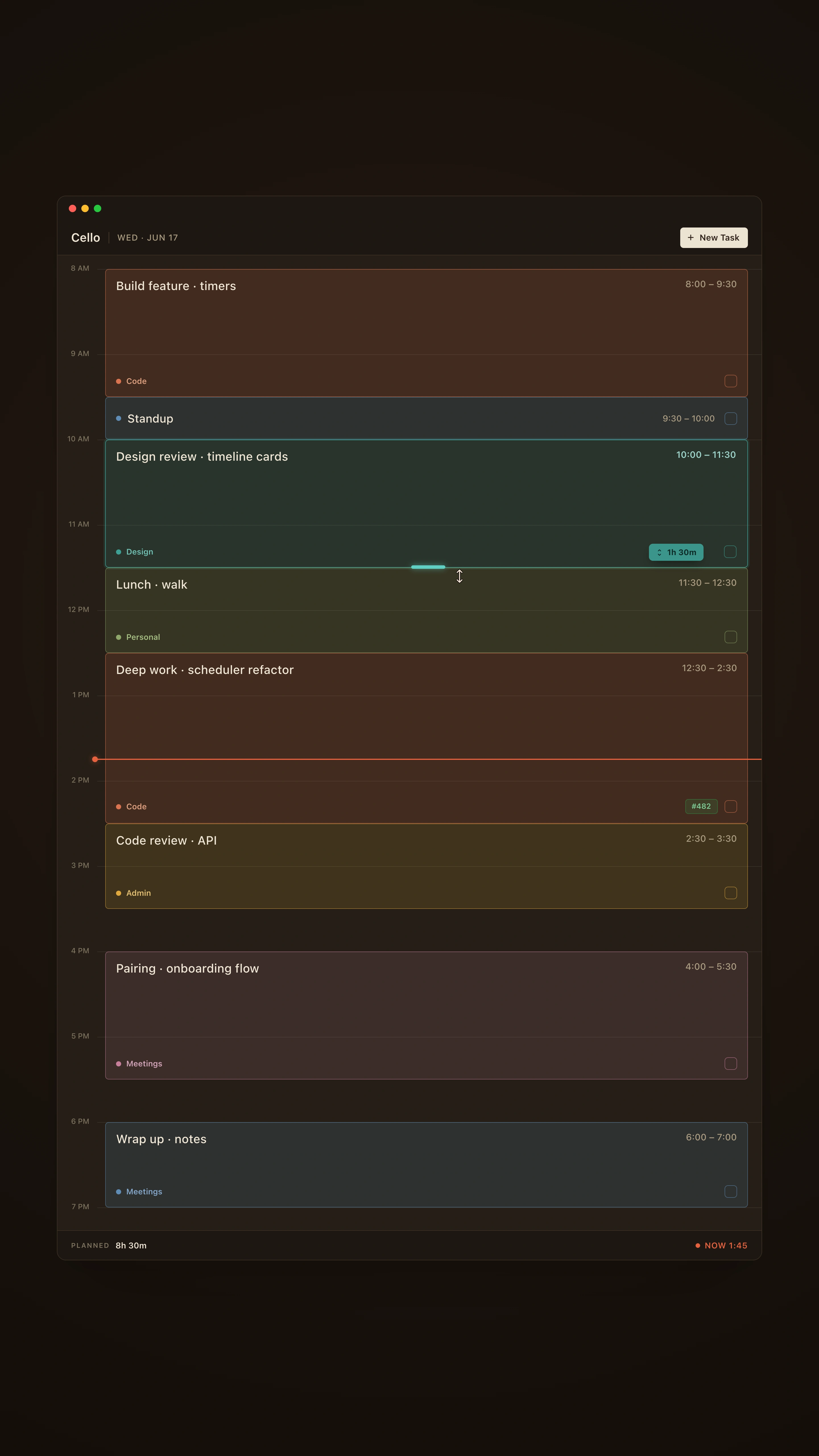
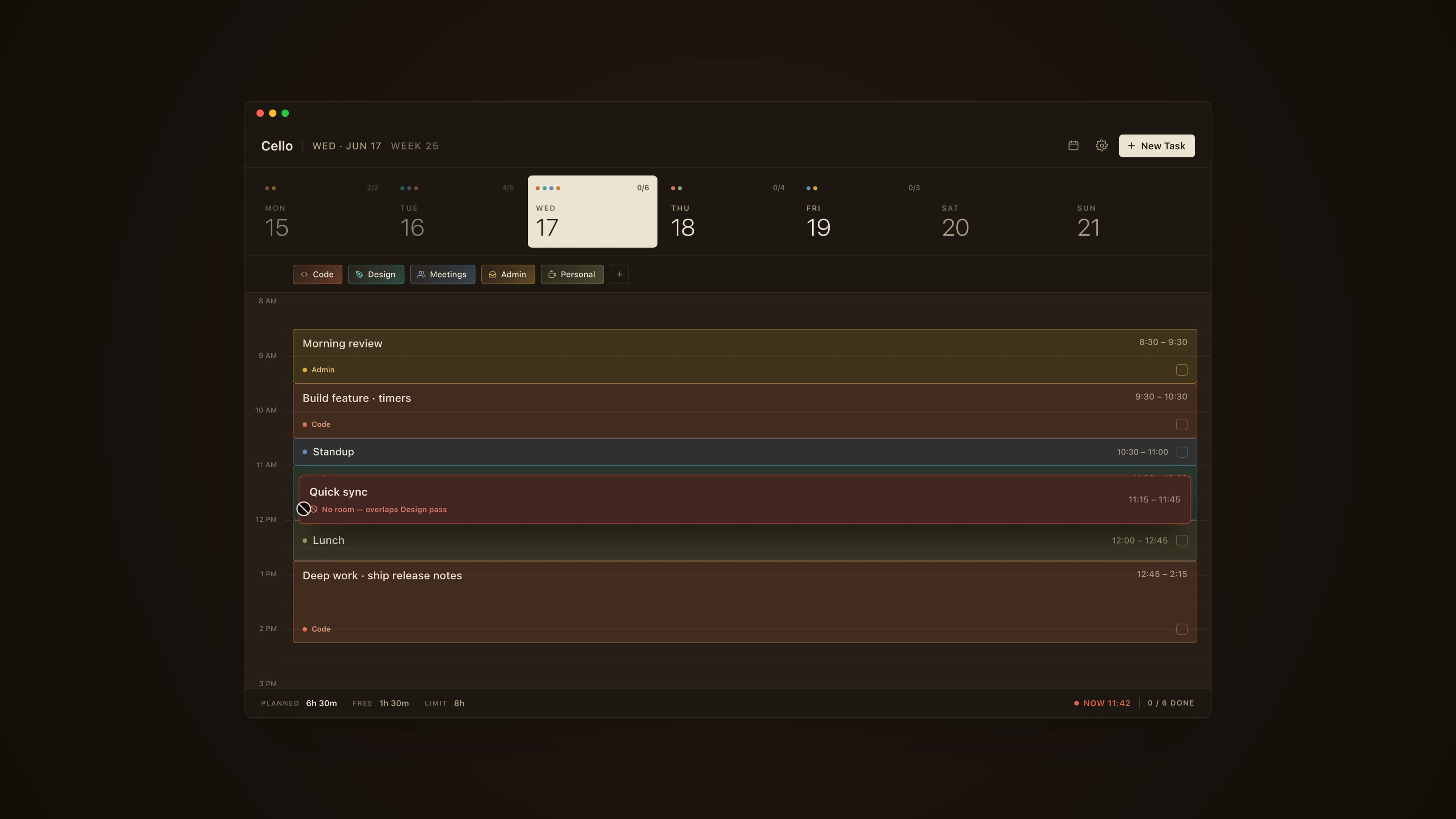
The whole app is built around a timeline of the day. You drag on it to make a task, stretch the block to say how long it'll take, and slide it around to move it, so planning feels like actually doing something instead of just wishing. Anything you haven't slotted in yet waits in a backlog off to the side, where you can jot things down the moment they pop into your head.
Planning around your calendar.
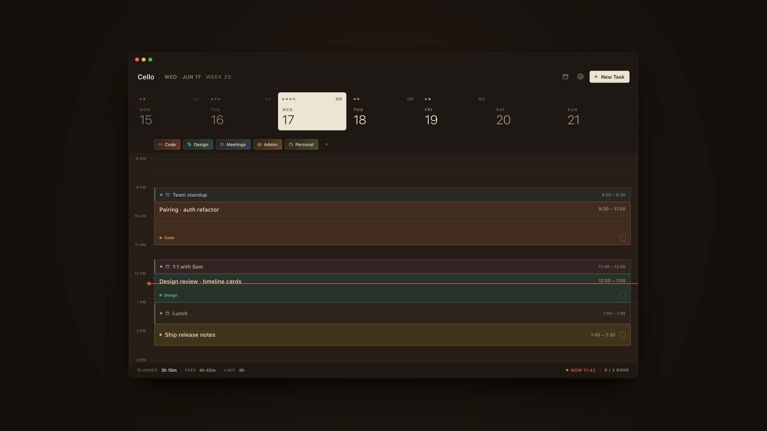
My day doesn't start as a blank slate. Cello pulls in my calendar so meetings and whatever's already booked show up right on the timeline. They're not tasks and I don't fiddle with them here. They're just the stuff that's already happening, so when I block out time to work, it's time I actually have.
When blocks collide.
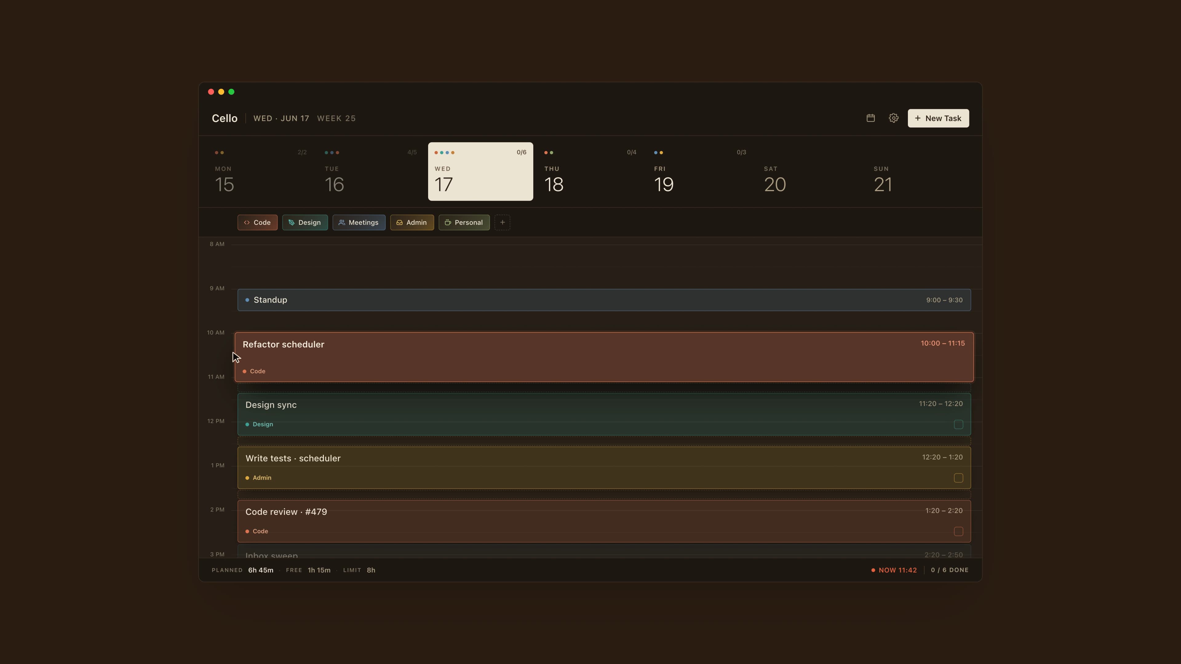
Dragging things around only feels good if the app is smart about what happens when two blocks bump into each other. So I taught it to nudge the neighbors out of the way, pushing the rest of the day down, or swap two blocks when that just makes more sense, and it never lets you cram in more than the day can actually hold.
One thing at a time.
Cello flat-out won't let two tasks overlap. That's on purpose: a day is one lane, not a pile of things happening at once, so when you commit to a block you're committing to one thing. The app keeps me honest so I don't have to: I can't sneak in a second thing on top of an hour I've already spoken for, which means the plan stays real about what focus actually costs.
Cards that keep their own time.
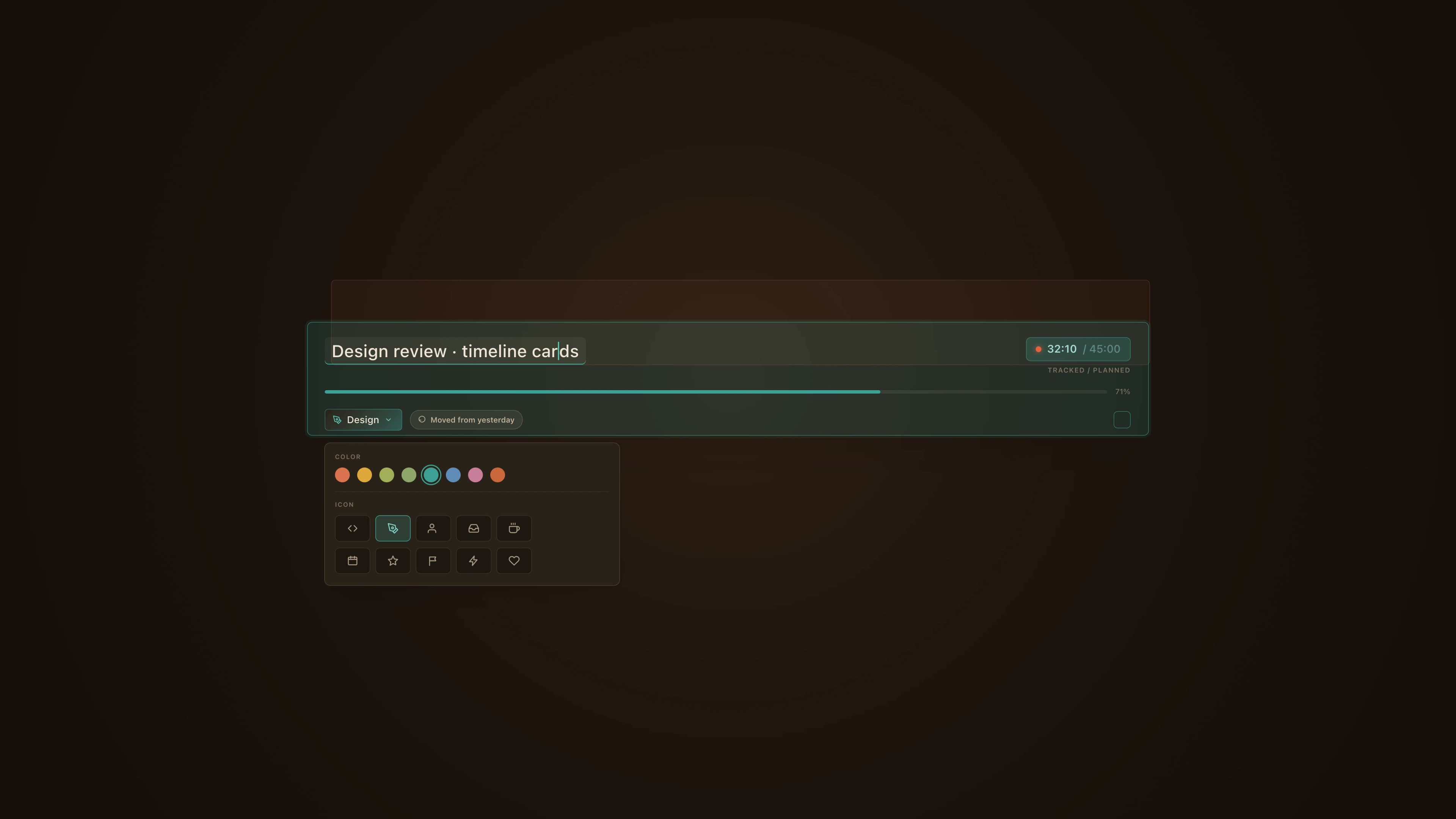
Every block is a little card you can edit right where it sits: rename it, tag it, check it off when it's done. Tags get a color and an icon so the day is easy to read at a glance. Each card runs its own timer that quietly tracks how long something actually took versus how long I thought it would. And anything I don't finish today just slides back into the backlog when I open the app tomorrow, instead of silently vanishing.
Tasks linked to GitHub.
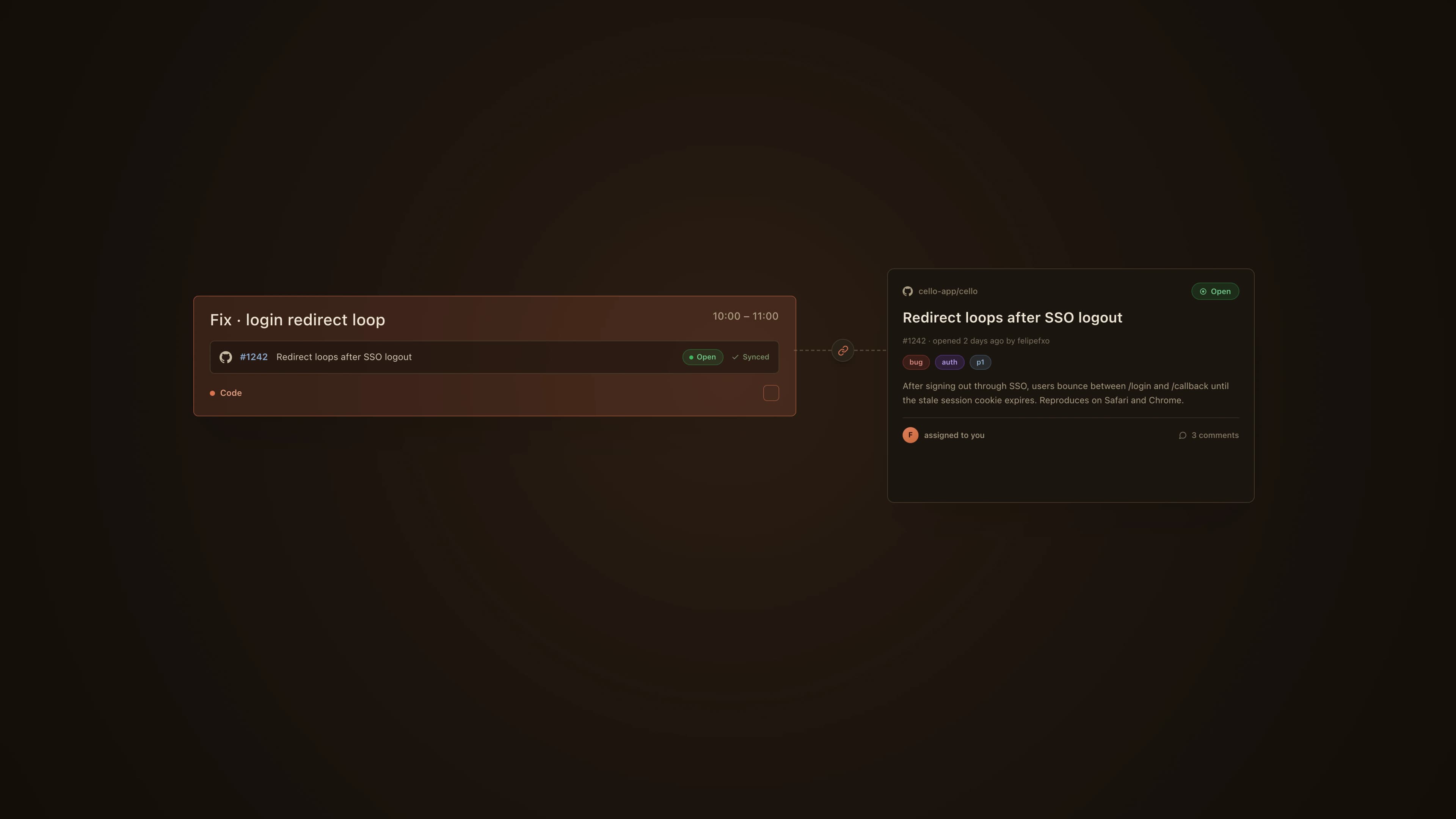
I can hook a task up to a GitHub issue so my plan stays tied to the actual work. The two keep each other in sync on their own, so what I line up in Cello and what I'm tracking on GitHub stay on the same page, instead of turning into two separate lists I have to babysit.
Seeing where the week went.
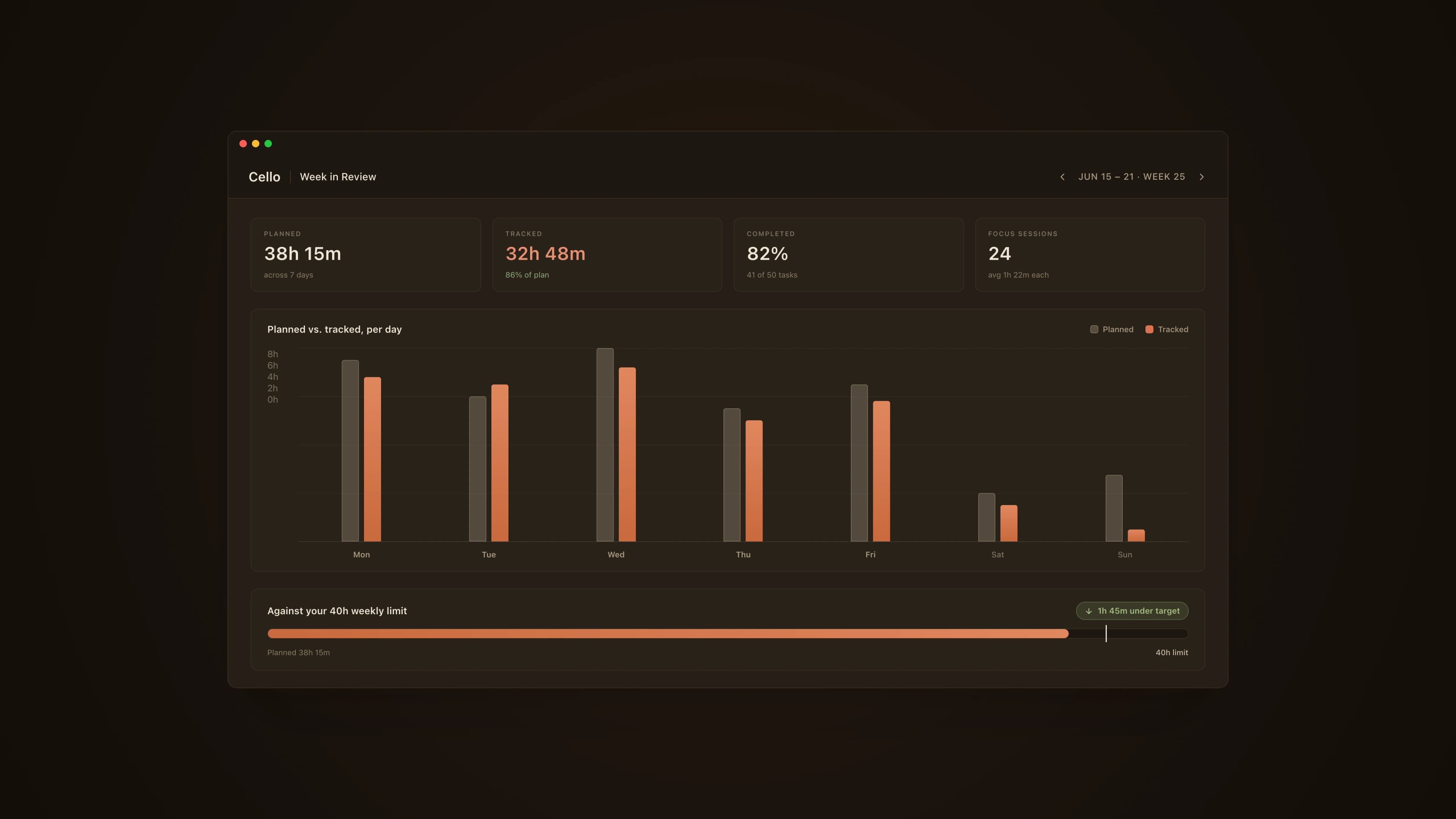
All those blocks and timers add up to a picture of my week. I can see how much I set out to do, where I guessed wrong on how long things would take, how much I actually got through, and how many hours I really put in. Set against the limits I give myself, it just tells me straight whether I'm overdoing it, coasting, or landing about right, so planning becomes something I learn from instead of guess at.